More Material Girl.
Posted by Michelle on March 30th, 2010 . Filed under: Uncategorized .I’ll tell you what, I just love saying or typing “Material Girl” because it totally gets me singing that Madonna song from back in the day. I used to love me some Madonna.
You must be my lucky star….cuz you shine on me wherever you are….
So…yeah. 2 days, 2 Cosmo Cricket Material Girl posts. Has anyone tried the new inks from Papertrey Ink – with the new formula? This is the first one I’ve gotten that way – Terracotta Tile – and, um…not a fan. It’s like too pasty/sticky or something and when you take the stamp off from the paper, it pulls off some of the ink and just does not leave a nice impression. I wish all the dark colors could stay the old formula and just the light ones changed.
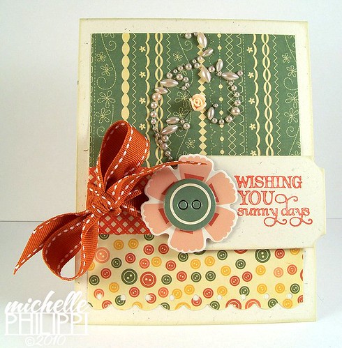
This first card has some Material Girl chipboard, some Prima Say it in Pearls with the little roses, and a new Verve sentiment from Let it Shine.
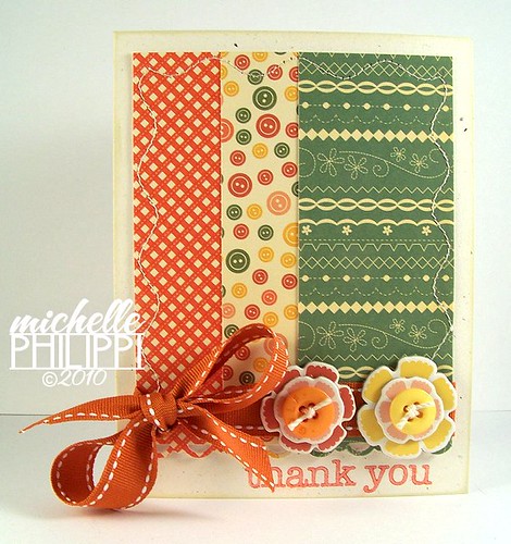
Got the same goin’ on with my second card except with a lil’ Hero Arts stamp.
Thanks for stopping in today!


March 30th, 2010 at 8:22 am
I for one quite like the new inks, but I've always been a big fan of pigments inks. Back before I knew PTI, I used Colorbox inks, and just got used to how they stamp, I guess. But I know lots of people with your same complaint. On this card, I have to say, I love seeing the TT with something so spring like. You definitely have a way with colors!
March 30th, 2010 at 10:30 am
I love me some Madonna LOL! I do the same thing : ) Love your cards! The color combos are so fun, and the stitching, pearls, and other embellies look fab! I agree about the new PTI inks. I have one color that won't even stamp. All of the pigment stays on the stamp and won't go on the paper!!! Not good when you have a solid image. Not going to be buying any more of those I don't think…
March 30th, 2010 at 12:05 pm
Super cute cards. When I think of this line I go straight to I'm a ma-ma-material…I'm a ma-ma-material giiiirrrrll (got the head bob and everything).
I agree with you on the PTI new formulation. I stocked up on the old refils. They are just like SU! Craft ink. You have to lightly tap the ink on like a gentle kissing…this will prevent the pooling on the sides.
March 30th, 2010 at 12:06 pm
These are so lovely, and the colors are totally rockin'! I'm probably in the minority, but I love the new inks… LOL Are you using less pressure when you stamp with them? That seems to do the trick for me… 🙂
March 30th, 2010 at 6:50 pm
Yea I'm not a fan either. I don't think they are even good pigment inks. I love the ColorBox pigment. I didn't like the old ones either though. I love these cards!
March 31st, 2010 at 2:31 pm
these are both gorgeous..great design, paper, and embellies!
enjoy *~*
March 31st, 2010 at 5:15 pm
I love these colors…I think I might be off-loading my SU! stuff and going more towards PTI!
April 8th, 2010 at 4:35 pm
Gorgeous cards. Love this mix of papers and your fun embellishments.